modifier의 기본적인 내용, 커스텀 컴포저블을 생성하는 방법, 하위요소들을 수동으로 측정하고 배치하는 방법에 대해서 알았으므로 modifier가 내부에서 어떻게 작동하는지 더 잘 이해할 수 있을 것이다.
요약하자면, modifier들은 우리가 컴포저블의 행동을 커스텀 할 수 있도록 한다. 다양한 modifier들을 체이닝하여 함께 결합할 수 있다. 여러가지 형식의 modifier들이 있지만, 이번 섹션에서는 UI 컴포넌트가 측정되고 배치되는 방식을 변경할 수 있으므로 LayoutModifier에 초점을 맞출 것이다.
컴포저블은 자체 콘텐츠에 대한 책임이 있으며, 해당 컴포저블의 작성자가 명시적인 API를 노출하지 않는 한 상위 컴포저블이 해당 콘텐츠를 검사하거나 조작할 수 없다. 유사하게, 컴포저블의 modifier은 수정하는 내용을 노출시키지 않고 작업을 수행한다. 즉, modifier들은 캡슐화 되어있다.
Modifier의 분석하기
Modifier 및 LayoutModifier는 public interface 이기 때문에, 자신만의 Modifier를 생성할 수 있다. 이전에 Modifier.padding을 사용했던 것처럼, Modifier를 좀 더 자세히 이해하기 위해 구현내용을 분석해보기로 하자.
padding은 LayoutModifier 인터페이스를 구현하는 클래스에 의해 지원되는 함수이며, measure 메서드를 재정의 한다. PaddingModifier는 일반적인 클래스로 equals()를 구현하여 modifier가 recomposition시에 비교 될 수 있도록 한다.
여기 아래의 예제를 보면, padding이 요소의 크기와 제약조건을 수정하는 방법을 알 수 있다.
// modifier를 생성하는 방법
@Stable
fun Modifier.padding(all: Dp) =
    this.then(
        PaddingModifier(start = all, top = all, end = all, bottom = all, rtlAware = true)
    )

// 세부내용 구현
private class PaddingModifier(
    val start: Dp = 0.dp,
    val top: Dp = 0.dp,
    val end: Dp = 0.dp,
    val bottom: Dp = 0.dp,
    val rtlAware: Boolean,
) : LayoutModifier {

    override fun MeasureScope.measure(
        measurable: Measurable,
        constraints: Constraints
    ): MeasureResult {

        val horizontal = start.roundToPx() + end.roundToPx()
        val vertical = top.roundToPx() + bottom.roundToPx()

        val placeable = measurable.measure(constraints.offset(-horizontal, -vertical))

        val width = constraints.constrainWidth(placeable.width + horizontal)
        val height = constraints.constrainHeight(placeable.height + vertical)
        return layout(width, height) {
            if (rtlAware) {
                placeable.placeRelative(start.roundToPx(), top.roundToPx())
            } else {
                placeable.place(start.roundToPx(), top.roundToPx())
            }
        }
    }
}
요소의 새로운 너비는 하위 요소의 너비가 되고, 시작 및 끝 padding 값은 요소의 너비 제약조건으로 강제 변환된다.
순서의 중요성
첫번째 섹션에서 봤듯이, Modifier를 체이닝할 때는 순서가 중요하다. modifier들은 먼저 호출된 것부터해서 나중에 호출된 것 순으로 컴포저블에 적용되므로, 먼저 호출된 modifier의 측정 및 전개 내용이 다음에 오는 modifier에 영향을 미친다. 컴포저블의 최종 사이즈는 매개변수로 전달된 모든 modifier들에 의존한다.
먼저, modifier들은 왼쪽에서 오른쪽으로 제약조건들을 갱신한다. 그런 뒤, 다시 오른쪽에서 왼쪽으로 사이즈를 반환한다. 백문이 불여일견 아래의 예제를 확인하도록 하자.
@Composable
fun BodyContent(modifier: Modifier = Modifier) {
    Row(
        modifier = modifier
            .background(color = Color.LightGray)
            .size(200.dp)
            .padding(16.dp)
            .horizontalScroll(rememberScrollState())
    ) {
        StaggeredGrid {
            for (topic in topics) {
                Chip(modifier = Modifier.padding(8.dp), text = topic)
            }
        }
    }
}
이 방법으로 modifier들이 적용된 모습은 다음과 같은 결과를 낳는다.
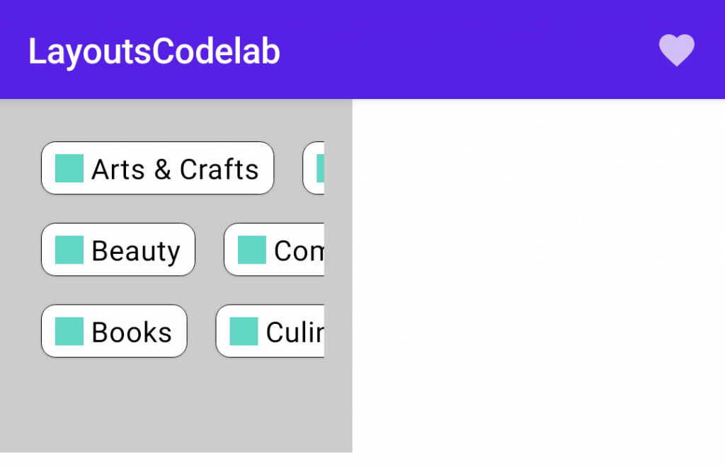
먼저, 배경을 변경하여 어떻게 UI에 modifier들이 영향을 주는지 본다. 그런 뒤에 너비 및 높이의 사이즈를 200dp로 제한한다. 그리고 마지막으로 텍스트와 주변부에 여백을 추가하는 padding을 적용한다.
왼쪽에서 오른쪽으로 제약조건이 전파되기 때문에, 측정되어지는 Row에 있는 내용과 함께 제약조건은 너비 및 높이에 대한 최소, 최대치에 대해 가로너비 200dp에서 양쪽에 padding 빼야하므로 168dp(=200dp-16dp-16dp)가 된다. 이것이 의미하는 점은 StaggeredGrid의 사이즈가 정확하게 168x168dp가 된다는 것이다. 그러므로, 사이즈를 수정하는 체이닝이 오른쪽에서 왼쪽으로 실행 된 후 스크롤 가능한 Row의 최종 사이즈는 200x200dp가 된다.
만약 먼저 padding을 적용하고 사이즈를 적용하기 위해 modifier들의 순서를 변경한다면, 다른 UI를 갖게 된다.
@Composable
fun BodyContent(modifier: Modifier = Modifier) {
    Row(
        modifier = modifier
            .background(color = Color.LightGray, shape = RectangleShape)
            .padding(16.dp)
            .size(200.dp)
            .horizontalScroll(rememberScrollState())
    ) {
        StaggeredGrid {
            for (topic in topics) {
                Chip(modifier = Modifier.padding(8.dp), text = topic)
            }
        }
    }
}
미리보기로 보면 다음과 같다.
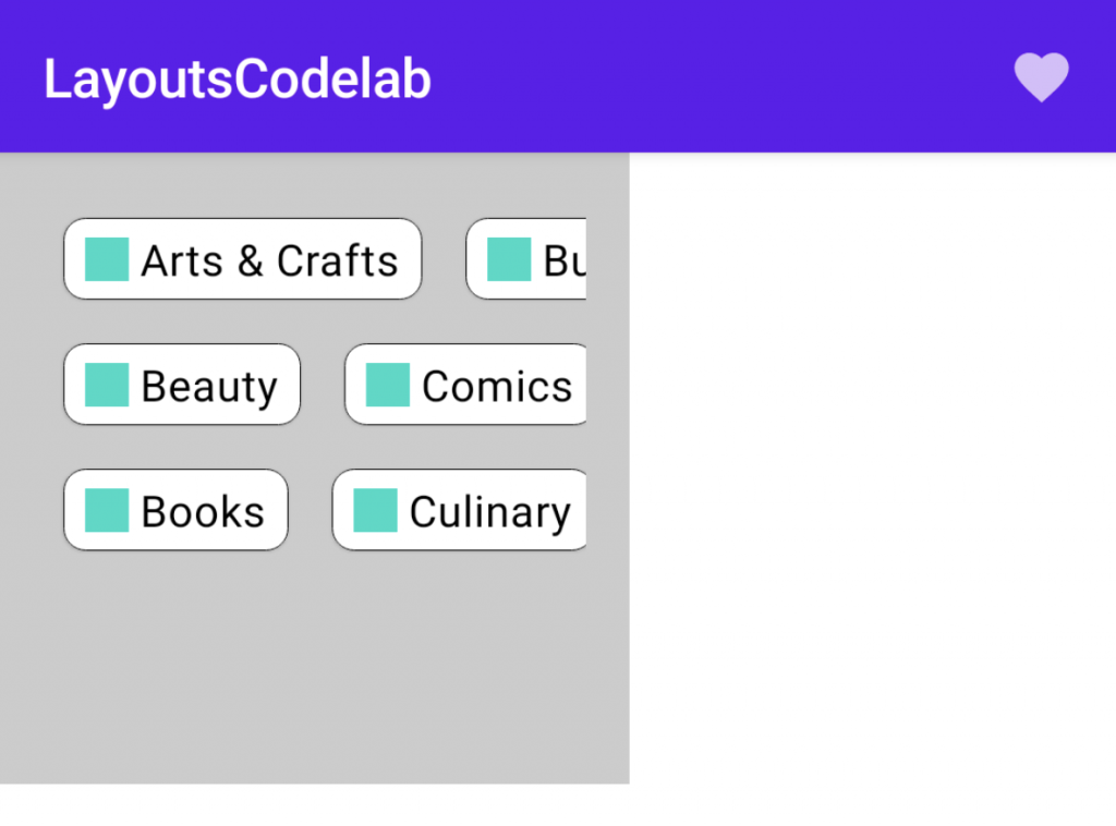
이 경우, 스크롤 가능한 Row 및 padding을 원래 가지고 있던 제약조건들은 하위 요소들을 측정하기 위해 size 제약조건으로 강제 변환된다. 그러므로 StaggeredGrid는 최소 및 최대에 대한 너비 및 높이 둘다 200dp로 제한된다. StaggeredGrid 사이즈는 200×200 dp이고 사이즈가 오른쪽에서 왼쪽으로 수정됨에 따라, padding modifier는 Row의 사이즈를 증가시켜 (200+16+16) x (200+16+16) = 232×232 가 된다.
이 섹션에 대한 전체 코드
val topics = listOf(
    "Arts & Crafts", "Beauty", "Books", "Business", "Comics", "Culinary",
    "Design", "Fashion", "Film", "History", "Maths", "Music", "People", "Philosophy",
    "Religion", "Social sciences", "Technology", "TV", "Writing"
)

@Composable
fun LayoutsCodelab() {
    Scaffold(
        topBar = {
            TopAppBar(
                title = {
                    Text(text = "LayoutsCodelab")
                },
                actions = {
                    IconButton(onClick = { /* doSomething() */ }) {
                        Icon(Icons.Filled.Favorite, contentDescription = null)
                    }
                }
            )
        }
    ) { innerPadding ->
        BodyContent(Modifier.padding(innerPadding))
    }
}

@Composable
fun BodyContent(modifier: Modifier = Modifier) {
    Row(modifier = modifier
        .background(color = Color.LightGray)
        .padding(16.dp)
        .size(200.dp)
        .horizontalScroll(rememberScrollState()),
        content = {
            StaggeredGrid {
                for (topic in topics) {
                    Chip(modifier = Modifier.padding(8.dp), text = topic)
                }
            }
        })
}

@Composable
fun StaggeredGrid(
    modifier: Modifier = Modifier,
    rows: Int = 3,
    content: @Composable () -> Unit
) {
    Layout(
        modifier = modifier,
        content = content
    ) { measurables, constraints ->

        // Keep track of the width of each row
        val rowWidths = IntArray(rows) { 0 }

        // Keep track of the max height of each row
        val rowHeights = IntArray(rows) { 0 }

        // Don't constrain child views further, measure them with given constraints
        // List of measured children
        val placeables = measurables.mapIndexed { index, measurable ->
            // Measure each child
            val placeable = measurable.measure(constraints)

            // Track the width and max height of each row
            val row = index % rows
            rowWidths[row] += placeable.width
            rowHeights[row] = Math.max(rowHeights[row], placeable.height)

            placeable
        }

        // Grid's width is the widest row
        val width = rowWidths.maxOrNull()
            ?.coerceIn(constraints.minWidth.rangeTo(constraints.maxWidth)) ?: constraints.minWidth

        // Grid's height is the sum of the tallest element of each row
        // coerced to the height constraints
        val height = rowHeights.sumOf { it }
            .coerceIn(constraints.minHeight.rangeTo(constraints.maxHeight))

        // Y of each row, based on the height accumulation of previous rows
        val rowY = IntArray(rows) { 0 }
        for (i in 1 until rows) {
            rowY[i] = rowY[i - 1] + rowHeights[i - 1]
        }

        // Set the size of the parent layout
        layout(width, height) {
            // x co-ord we have placed up to, per row
            val rowX = IntArray(rows) { 0 }

            placeables.forEachIndexed { index, placeable ->
                val row = index % rows
                placeable.placeRelative(
                    x = rowX[row],
                    y = rowY[row]
                )
                rowX[row] += placeable.width
            }
        }
    }
}

@Composable
fun Chip(modifier: Modifier = Modifier, text: String) {
    Card(
        modifier = modifier,
        border = BorderStroke(color = Color.Black, width = Dp.Hairline),
        shape = RoundedCornerShape(8.dp)
    ) {
        Row(
            modifier = Modifier.padding(start = 8.dp, top = 4.dp, end = 8.dp, bottom = 4.dp),
            verticalAlignment = Alignment.CenterVertically
        ) {
            Box(
                modifier = Modifier
                    .size(16.dp, 16.dp)
                    .background(color = MaterialTheme.colors.secondary)
            )
            Spacer(Modifier.width(4.dp))
            Text(text = text)
        }
    }
}

@Preview
@Composable
fun ChipPreview() {
    LayoutsCodelabTheme {
        Chip(text = "Hi there")
    }
}

@Preview
@Composable
fun LayoutsCodelabPreview() {
    LayoutsCodelabTheme {
        LayoutsCodelab()
    }
}
0개의 댓글