Layout의 기초를 다뤄 보았다면, API의 유연성을 보여줄만한 더 복잡한 예제를 만들자. 다음 나오는 사진의 중앙에 있는 Material Study Owl의 커스텀 staggered grid를 만들어 보자.

Owl의 staggered grid는 아이템을 수직적으로 전개하고, 하나의 열에 주어진 n개의 행을 채워 넣는다. Row에 Column들을 채우는 방식으로는 staggered grid 레이아웃을 구성할 수 없다. 만약 준비된 데이터를 수직적으로 표현해야 한다고 가정하면, Column에 Row들을 채우는 식으로 만들 수는 있다.
하지만, 커스텀 레이아웃을 만들면 staggered grid 내의 모든 항목들의 높이를 제한할 수 있도록 할 수 있다. 그래서 더 레이아웃에 대해 좀 더 제어를 잘 하고, 커스텀을 하는 법에 대해서 배울 수 있다. 우리는 StaggeredGrid를 만들고 하위 요소를 측정하고 배치해보도록 하자.
만약 화면방향에 따라 grid를 재사용하고 싶게 만들고 싶다면, 화면에 보여주고 싶은 행의 갯수를 매개변수로 받을 수 있다. 해당 정보는 레이아웃이 호출될 때 와야 하므로 매개변수로 다음과 같이 전달한다.
@Composable
fun StaggeredGrid(
    modifier: Modifier = Modifier,
    rows: Int = 3,
    content: @Composable () -> Unit
) {
    Layout(
        modifier = modifier,
        content = content
    ) { measurables, constraints ->
        // 여기서 주어진 제약조건을 사용하여 측정하고 배치한다.
    }
}
이전과 마찬가지로 먼저 해야할 일은 하위요소들을 측정하는 것이다. 명심하자, 하위요소들은 한번만 측정할 수 있다.
지금 만드려고 하는 유즈케이스의 경우, 하위 view들을 제한하지는 않을 것이다. 하위 요소들을 측정할 때, 각 행의 너비와 최대 높이도 추적해야 한다.
Layout(
    modifier = modifier,
    content = content
) { measurables, constraints ->

    // 각 행에 대한 너비를 추적한다.
    val rowWidths = IntArray(rows) { 0 }

    // 각 행에 대한 최대 높이를 추적한다.
    val rowHeights = IntArray(rows) { 0 }

    // 하위 view들을 제한하지 않고, 주어진 제약조건들과 함께 측정한다.
    // List of measured children
    val placeables = measurables.mapIndexed { index, measurable ->

        // 각 하위 요소를 측정 한다.
        val placeable = measurable.measure(constraints)

        // Track the width and max height of each row
        val row = index % rows
        rowWidths[row] += placeable.width
        rowHeights[row] = Math.max(rowHeights[row], placeable.height)

        placeable
    }
    ...
}
코드를 보면 측정된 하위요소 목록들을 확인할 수 있다. 화면상에 배치되기 전에 grid의 전체 사이즈를 계산해야 한다. 또한, 각 행의 최대 높이를 이미 알기 때문에, 각 행의 Y 포지션에서 각 행의 요소를 배치할 위치를 계산할 수 있다. Y 포지션들을 rowY 변수에 저장한다.
Layout(
    content = content,
    modifier = modifier
) { measurables, constraints ->
    ...

    // Grid의 너비는 가장 넓은 행이다.
    val width = rowWidths.maxOrNull()
        ?.coerceIn(constraints.minWidth.rangeTo(constraints.maxWidth)) ?: constraints.minWidth

    // Grid의 높이는 높이 제약조건으로 인해 강제로 변한된 각 행의 가장 높은 요소의 합이다.
    val height = rowHeights.sumOf { it }
        .coerceIn(constraints.minHeight.rangeTo(constraints.maxHeight))

    // 이전 행들의 누적된 높이를 기반한, 각 행의 Y
    val rowY = IntArray(rows) { 0 }
    for (i in 1 until rows) {
        rowY[i] = rowY[i-1] + rowHeights[i-1]
    }

    ...
}
마침내 placeable.placeRelative(x, y)를 호출하여 자식요소들을 화면상에 배치할 수 있게 되었다. 이러한 유즈케이스의 경우, rowX 변수로 각 행에 대한 X 좌표 또한 추적해야 한다.
Layout(
    content = content,
    modifier = modifier
) { measurables, constraints ->
    ...

    // 상위 레이아웃의 사이즈를 설정하자.
    layout(width, height) {
        // 각 행마다, 배치해야할 x좌표
        val rowX = IntArray(rows) { 0 }

        placeables.forEachIndexed { index, placeable ->
            val row = index % rows
            placeable.placeRelative(
                x = rowX[row],
                y = rowY[row]
            )
            rowX[row] += placeable.width
        }
    }
}
커스텀 StaggeredGrid 사용하기
자 이제, 하위요소를 측정하고 배치할 줄 아는 커스텀 grid 레이아웃을 갖게 되었다. 앱에서 이걸 한번 사용해보자. grid에서 Owl의 Chip들을 시뮬레이션 해보기 위해, 유사한 작업을 수행하는 컴포저블을 쉽게 만들 수 있다.
@Composable
fun Chip(modifier: Modifier = Modifier, text: String) {
    Card(
        modifier = modifier,
        border = BorderStroke(color = Color.Black, width = Dp.Hairline),
        shape = RoundedCornerShape(8.dp)
    ) {
        Row(
            modifier = Modifier.padding(start = 8.dp, top = 4.dp, end = 8.dp, bottom = 4.dp),
            verticalAlignment = Alignment.CenterVertically
        ) {
            Box(
                modifier = Modifier.size(16.dp, 16.dp)
                    .background(color = MaterialTheme.colors.secondary)
            )
            Spacer(Modifier.width(4.dp))
            Text(text = text)
        }
    }
}

@Preview
@Composable
fun ChipPreview() {
    LayoutsCodelabTheme {
        Chip(text = "Hi there")
    }
}
미리보기로 보면 다음과 같다.

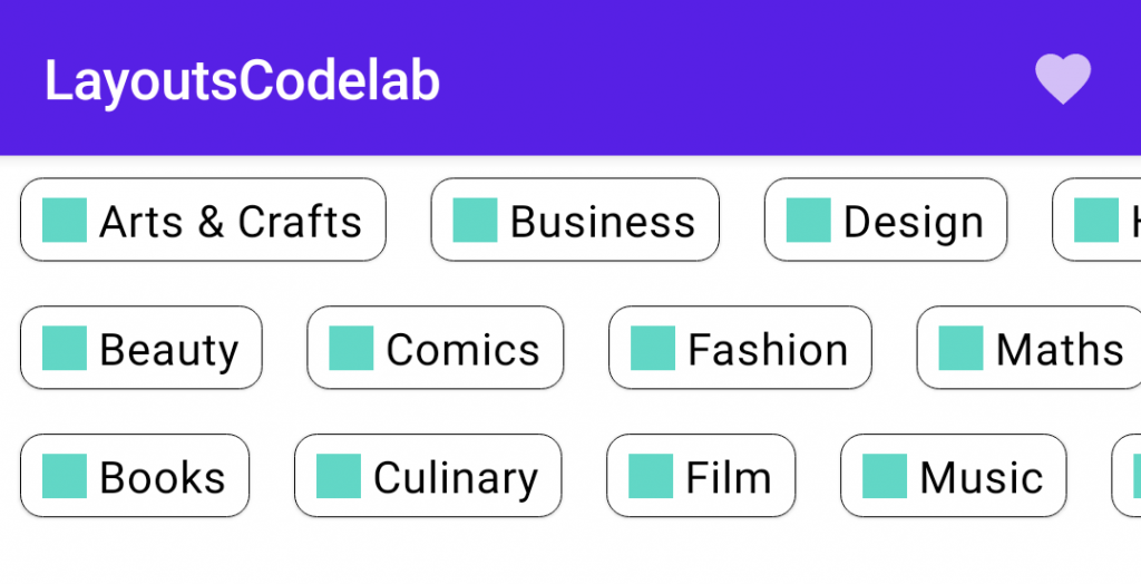
이제 BodyContent에 나타낼 수 있고, StaggeredGrid에 보여줄 수 있는 토픽 목록을 생성해보도록 하자.
val topics = listOf(
    "Arts & Crafts", "Beauty", "Books", "Business", "Comics", "Culinary",
    "Design", "Fashion", "Film", "History", "Maths", "Music", "People", "Philosophy",
    "Religion", "Social sciences", "Technology", "TV", "Writing"
)


@Composable
fun BodyContent(modifier: Modifier = Modifier) {
    StaggeredGrid(modifier = modifier) {
        for (topic in topics) {
            Chip(modifier = Modifier.padding(8.dp), text = topic)
        }
    }
}

@Preview
@Composable
fun LayoutsCodelabPreview() {
    LayoutsCodelabTheme {
        BodyContent()
    }
}
미리보기로 보면 다음과 같다.
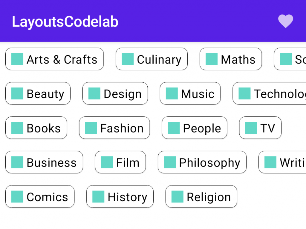
grid의 행 갯수를 변경할 수 있고, 기대한대로 잘 동작한다는 것을 알 수 있다.
@Composable
fun BodyContent(modifier: Modifier = Modifier) {
    StaggeredGrid(modifier = modifier, rows = 5) {
        for (topic in topics) {
            Chip(modifier = Modifier.padding(8.dp), text = topic)
        }
    }
}
미리보기로보면 다음과 같다.
행들의 갯수에 의존하기 때문에, 토픽들이 화면 밖으로 나갈 수 있다. 단지, 스크롤 가능한 Row로 StaggeredGrid를 감싸고 StaggeredGrid 대신에 Row에 modifier를 적용하여, 스크롤 가능한 BodyContent 만들어야 한다.
@Composable
fun BodyContent(modifier: Modifier = Modifier) {
    Row(modifier = modifier.horizontalScroll(rememberScrollState())) {
        StaggeredGrid {
            for (topic in topics) {
                Chip(modifier = Modifier.padding(8.dp), text = topic)
            }
        }
    }
}
만약 안드로이드 스튜디오에 있는 Interactive Preview 버튼을 사용하거나 실기기에서 앱을 실행하면, 수평적으로 컨텐츠를 스크롤 할 수 있는 것을 확인할 수 있다.
StaggeredGrid의 전체 코드는 다음과 같다.
@Composable
fun StaggeredGrid(
    modifier: Modifier = Modifier,
    rows: Int = 3,
    content: @Composable () -> Unit
) {
    Layout(
        modifier = modifier,
        content = content
    ) { measurables, constraints ->

        // Keep track of the width of each row
        val rowWidths = IntArray(rows) { 0 }

        // Keep track of the max height of each row
        val rowHeights = IntArray(rows) { 0 }

        // Don't constrain child views further, measure them with given constraints
        // List of measured children
        val placeables = measurables.mapIndexed { index, measurable ->

            // Measure each child
            val placeable = measurable.measure(constraints)

            // Track the width and max height of each row
            val row = index % rows
            rowWidths[row] += placeable.width
            rowHeights[row] = Math.max(rowHeights[row], placeable.height)

            placeable
        }
        // Grid's width is the widest row
        val width = rowWidths.maxOrNull()
            ?.coerceIn(constraints.minWidth.rangeTo(constraints.maxWidth)) ?: constraints.minWidth

        // Grid's height is the sum of the tallest element of each row
        // coerced to the height constraints
        val height = rowHeights.sumOf { it }
            .coerceIn(constraints.minHeight.rangeTo(constraints.maxHeight))

        // Y of each row, based on the height accumulation of previous rows
        val rowY = IntArray(rows) { 0 }
        for (i in 1 until rows) {
            rowY[i] = rowY[i-1] + rowHeights[i-1]
        }

        // Set the size of the parent layout
        layout(width, height) {
            // x cord we have placed up to, per row
            val rowX = IntArray(rows) { 0 }

            placeables.forEachIndexed { index, placeable ->
                val row = index % rows
                placeable.placeRelative(
                    x = rowX[row],
                    y = rowY[row]
                )
                rowX[row] += placeable.width
            }
        }
    }
}

0개의 댓글