ConstraintLayout은 컴포저블을 다른 컴포저블들에 관련지어 화면상에 배치 할 수 있게 하고, 여러개의 Row, Column 및 Box를 사용하는 것에 대한 대안이 된다. ConstraintLayout은 더 복잡한 정렬이 필요하거나, 더 큰 레이아웃들을 구현할 때 유용하다.
Note: View시스템에서 ConstraintLayout은 flat한 View계층을 갖는것이 성능상으로 더 좋기 때문에, 크고 복잡한 레이아웃을 만들 때 추천했었다. 하지만 Compose에서는 효율적으로 깊은 레이아웃 계층을 다룰수 있기 때문에, 이런 부분이 걱정거리는 아니다.
컴포즈 Constraint Layout 의존성은 다음과 같이 build.gradle에 추가 할 수 있다. 최신버전은 공식문서에서 확인할 수 있다.
// build.gradle
implementation "androidx.constraintlayout:constraintlayout-compose:1.0.0-rc01"
컴포즈의 ConstraintLayout는 DSL로 동작한다.
- createRefs()(또는 createRef())을 사용하여 참조를 할 수 있고 ConstraintLayout내에 있는 각 컴포저블은 연관된 참조를 갖는 것을 필요로 한다.
- Constraint(제약조건)는 constrainAs라는 modifier를 사용하여 제공된다. 이는 매개변수로 참조를 취하고, 람다식의 몸체에서 제약조건을 명시 하도록 한다.
- Constraints는 linkTo를 사용 또는 다른 유용한 메서드들을 사용하여 명시된다.
- parent는 ConstraintLayout 컴포저블 쪽으로 제약조건을 명시할 때 사용될 수 있는 이미 존재하는 참조 방식이다.
단순한 예제와 함께 시작해보자.
@Composable
fun ConstraintLayoutContent() {
ConstraintLayout {
// 컴포저블을 통제하기 위해 참조들을 생성한다.
val (button, text) = createRefs()
Button(
onClick = { /* Do something */ },
// "button" 참조를 Button 컴포저블에 배정한다.
// 그리고 ConstraintLayout의 top에 제약조건을 설정한다.
modifier = Modifier.constrainAs(button) {
top.linkTo(parent.top, margin = 16.dp)
}
) {
Text("Button")
}
// "text" 참조를 Text 컴포저블에 배정한다.
// 그리고 Button 컴포저블 bottom에 제약조건을 설정한다.
Text("Text", Modifier.constrainAs(text) {
top.linkTo(button.bottom, margin = 16.dp)
})
}
}
@Preview
@Composable
fun ConstraintLayoutContentPreview() {
LayoutsCodelabTheme {
ConstraintLayoutContent()
}
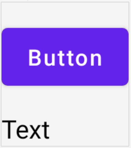
}위 코드는 Button의 top 제약조건은 parent에 설정하고, margin을 16.dp 적용한다. 그리고 Text는 Button의 bottom부분에 제약조건을 설정하고, margin을 16.dp 설정한다.
만약 텍스트를 수평적으로 중심에 두기를 원한다면, centerHorizontallyTo 함수를 사용하여 Text의 start 및 end를 parent의 가장자리 부분에 설정하면 된다.
@Composable
fun ConstraintLayoutContent() {
    ConstraintLayout {
        ... // Same as before

        Text("Text", Modifier.constrainAs(text) {
            top.linkTo(button.bottom, margin = 16.dp)
            // 텍스트를 ConstraintLayout 중앙에 정렬한다.
            centerHorizontallyTo(parent)
        })
    }
}
미리보기로 보면 다음과 같다.
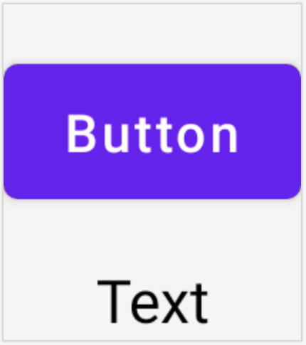
ConstraintLayout의 사이즈는 컨텐츠를 감쌀만큼 가능한 작은 사이즈가 된다. 그렇기 때문에 Text가 parent 대신 Button의 중앙에 있는 것처럼 보인다. 만약 다른 크기 조절이 필요한 경우, 사이즈를 조절할 수 있는 modifiers(예를들면 fillMaxSize, size)를 Compose의 다른 레이아웃과 마찬가지로 ConstraintLayout 컴포저블에 적용할 수 있다.
Helper
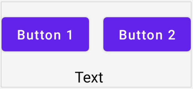
DSL은 또한 guidline, barrier 및 chain을 생성을 지원한다. 예시를 보자.
@Composable
fun ConstraintLayoutContent() {
    ConstraintLayout {
        // ConstraintLayout내에 3가지 컴포저블들을 위한 레퍼런스들을 생성한다.
        val (button1, button2, text) = createRefs()

        Button(
            onClick = { /* Do something */ },
            modifier = Modifier.constrainAs(button1) {
                top.linkTo(parent.top, margin = 16.dp)
            }
        ) {
            Text("Button 1")
        }

        Text("Text", Modifier.constrainAs(text) {
            top.linkTo(button1.bottom, margin = 16.dp)
            centerAround(button1.end)
        })

        val barrier = createEndBarrier(button1, text)
        Button(
            onClick = { /* Do something */ },
            modifier = Modifier.constrainAs(button2) {
                top.linkTo(parent.top, margin = 16.dp)
                start.linkTo(barrier)
            }
        ) {
            Text("Button 2")
        }
    }
button1 및 text 참조를 매개변수로 하여 barrier를 생성했다. 미리보기를 통해 확인하자.
- barrier(및 다른 모든 helper들)는 ConstraintLayout 함수 몸체에서 생성될 수 있다. 하지만 constrainAs는 아니다.
- linkTo는 guideline 및 barrier와 함께 같은 방식으로 레이아웃의 가장자리 부분에 제약조건을 설정할 수 있다.
Dimension 커스텀하기
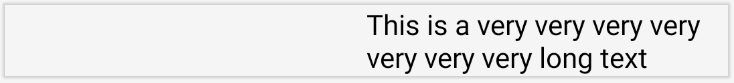
기본적으로 ConstraintLayout 하위 요소들은 그들의 컨텐츠 사이즈를 감싸는데 필요한 정도의 사이즈를 선택하는 것을 허용하도록 되어있다. 예를 들면, 이것은 Text의 내용이 너무 길 때, 화면 경계 밖으로 나갈 수 있음을 의미한다.
@Composable
fun LargeConstraintLayout() {
    ConstraintLayout {
        val text = createRef()

        val guideline = createGuidelineFromStart(fraction = 0.5f)
        Text(
            "This is a very very very very very very very long text",
            Modifier.constrainAs(text) {
                linkTo(start = guideline, end = parent.end)
            }
        )
    }
}

@Preview
@Composable
fun LargeConstraintLayoutPreview() {
    LayoutsCodelabTheme {
        LargeConstraintLayout()
    }
}
분명히 사용가능한 공간내에서 텍스트를 개행하고 싶을 것이다. 이를 위해서는 text의 width 동작을 변경해야 한다.
@Composable
fun LargeConstraintLayout() {
    ConstraintLayout {
        val text = createRef()

        val guideline = createGuidelineFromStart(0.5f)
        Text(
            "This is a very very very very very very very long text",
            Modifier.constrainAs(text) {
                linkTo(guideline, parent.end)
                width = Dimension.preferredWrapContent
            }
        )
    }
}
미리보기로 보면 다음과 같다.
사용 가능한 Dimension 동작은 다음과 같다.
- wrapContent – 컨텐츠를 감싸면서 동적으로 사이즈를 변화시킨다. 심지어 주어진 제약 조건을 위반하면서 사이즈를 변경할 수 있다.(화면밖으로 벗어날 수 있음)
- preferredWrapContent – 기본적으로 wrapContent와 같지만, 주어진 제약조건내에서 컨텐츠를 감싼다. (화면 밖을 벗어나지 않음)
- fillToConstraints – 레이아웃을 확장시켜 해당 dimension의 제약조건에 의해 규정된 공간을 채운다.
- value -주어진 제약조건이 있음에도 레이아웃은 고정된 dp 값을 갖는다. (화면 밖을 벗어날 수 있음)
- preferredValue – 주어진 제약조건을 잘 지키며, 고정된 dp값을 갖는다. (화면 밖을 벗어나지 않음)
또한 어떤 Dimension들은 강제될 수 있다.
width = Dimension.preferredWrapContent.atLeast(100.dp)Decoupled API
지금까진 예제에서 제약조건들은 컴포저블내에 적용된 modifier와 함께 inline으로 명시되어져 왔다. 하지만 레이아웃에 적용된 제약조건들을 분리시킬 때 몇가지 쓸만한 내용들이 있다. 일반적인 예는 화면 구성을 기반으로 제약 조건을 쉽게 변경하거나, 2개의 제약 조건 세트 간에 애니메이션을 적용하는 것이다.
이러한 경우에 ConstraintLayout을 다른 방법으로 사용할 수 있다.
- ConstraintSet을 매개변수로 ConstraintLayout에 전달한다.
- ConstraintSet에서 Modifier의 layoutId를 사용하여 생성된 참조를 컴포저블에 배정한다.
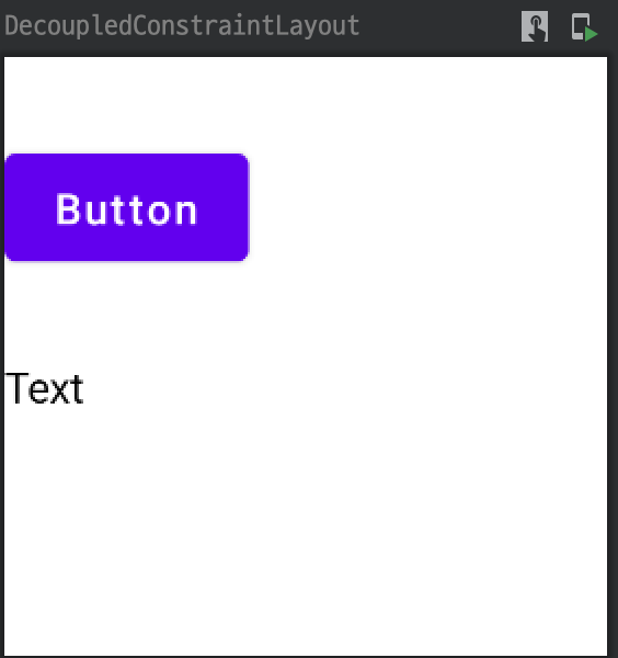
위의 첫 번째 ConstraintLayout 예제에 적용된 이 API 모양은 화면 너비에 최적화되어 다음과 같다.
@Composable
fun DecoupledConstraintLayout() {
    BoxWithConstraints {
        val constraints = if (maxWidth < maxHeight) {
            decoupledConstraints(margin = 16.dp) // Portrait constraints
        } else {
            decoupledConstraints(margin = 32.dp) // Landscape constraints
        }

        ConstraintLayout(constraints) {
            Button(
                onClick = { /* Do something */ },
                modifier = Modifier.layoutId("button")
            ) {
                Text("Button")
            }

            Text("Text", Modifier.layoutId("text"))
        }
    }
}

private fun decoupledConstraints(margin: Dp): ConstraintSet {
    return ConstraintSet {
        val button = createRefFor("button")
        val text = createRefFor("text")

        constrain(button) {
            top.linkTo(parent.top, margin= margin)
        }
        constrain(text) {
            top.linkTo(button.bottom, margin)
        }
    }
}
미리보기로 보면 다음과 같다.
Note: Modifier.layoutId 함수는 tag가 없는 id만 단일 매개변수로 갖는 메서드를 사용해야 한다.

0개의 댓글