컬러나 서체와 마찬가지로, 모양(shape) 테마를 설정하면 Material 컴포넌트에 반영된다. 예를 들어 Button은 작은 컴포넌트에 대해 설정된 모양을 선택한다.
@Composable
fun Button( ...
  shape: Shape = MaterialTheme.shapes.small
) {
색상과 마찬가지로 Material 컴포넌트는 기본 매개변수를 사용하므로, 컴포넌트가 사용할 모양(shape)의 카테고리를 확인하거나 대안을 제공하는 것이 간단하다. shape 카테고리에 대한 컴포넌트 전체는 공식문서를 확인하자.
일부 컴포넌트는 컨텍스트에 맞게 수정된 테마 shape을 사용한다. 예를 들어 기본적으로 TextField는 MaterialTheme.shapes.small 테마를 사용하지만, 아래쪽 모서리에는 모서리 크기가 0dp로 적용된다. (원래는 4dp)
@Composable
fun FilledTextField(
  // other parameters
  shape: Shape = MaterialTheme.shapes.small.copy(
    bottomStart = ZeroCornerSize, // overrides small theme style
    bottomEnd = ZeroCornerSize // overrides small theme style
  )
) {
테마 모양
물론, 컴포저블 또는 Modifier를 사용하여 자신만의 컴포넌트를 만들 때 shape을 직접 사용할 수 있다. 예를 들어, Surface, Modifier.clip, Modifier.background, Modifier.border 등이 있다.
@Composable
fun UserProfile(
...
shape: Shape = MaterialTheme.shapes.medium
) {
Surface(shape = shape) {
...
}
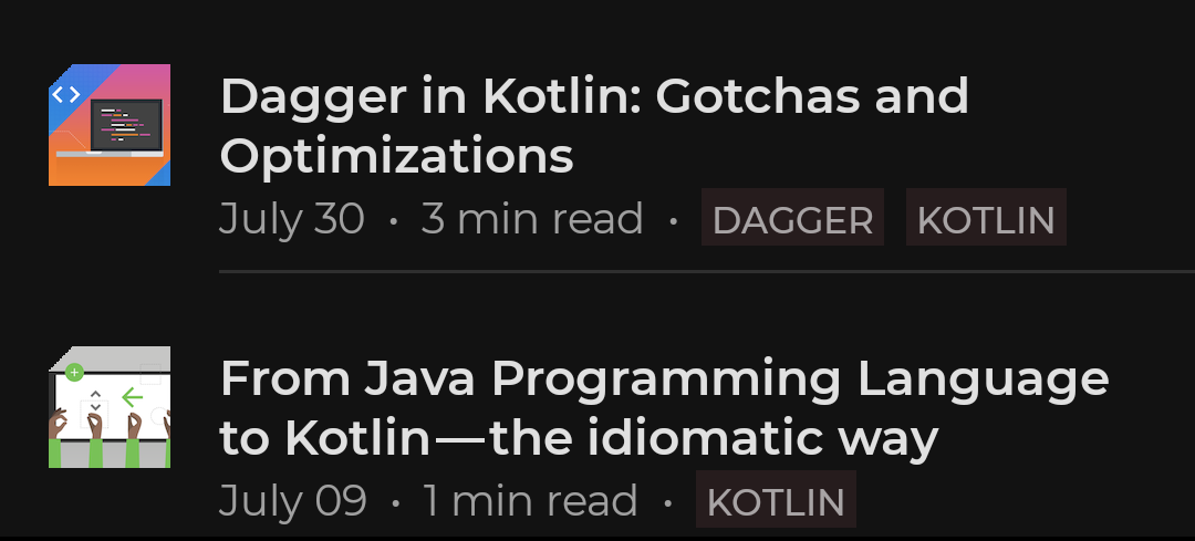
}PostItem에 표시되는 이미지에 shape 테마를 추가해보자. 왼쪽 상단 모서리를 자르기 위해 clip Modifier를 사용하여 테마의 shape small을 적용한다.
@Composable
fun PostItem(...) {
  ...
  Image(
    painter = painterResource(post.imageThumbId),
    modifier = Modifier.clip(shape = MaterialTheme.shapes.small)
  )

0개의 댓글